Interval Weight Loss
Project Information
IWL is a clinically tested, lifestyle-based weight loss program developed by obesity researcher Dr Nick Fuller.
Business Challenge
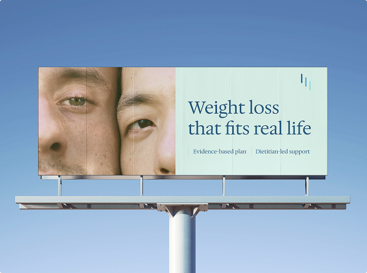
IWL had expanded its services into professional healthcare channels, however its consumer-led brand did not signal the clinical credibility and professional support behind the service. A brand refresh was needed to differentiate IWL from fast-results, app-led weight loss programs and position IWL as a trusted brand for professional healthcare partners and prospective patients.
Brand Solution
A core insight we found was that people did not need another promise of fast transformation. They needed a credible, supported method they could believe in after years of dieting attempts to keep weight off. We built IWL’s visual identity in mind with its core strengths and audience: credible, qualified support and a sustainable approach to weight loss – without throwing away what made the brand trusted to begin with.
Visual Identity
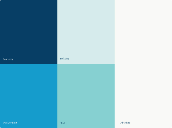
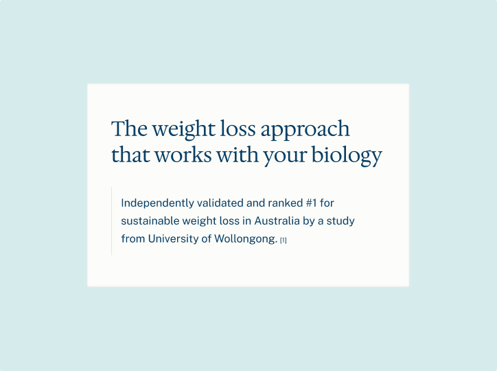
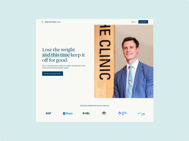
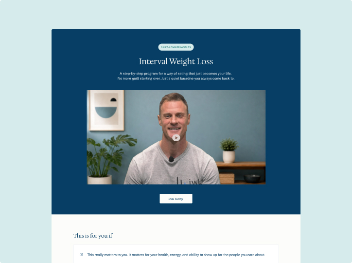
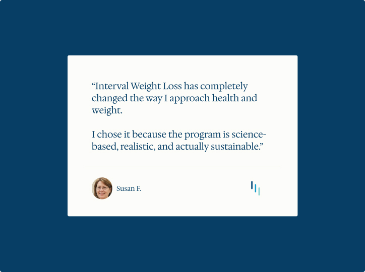
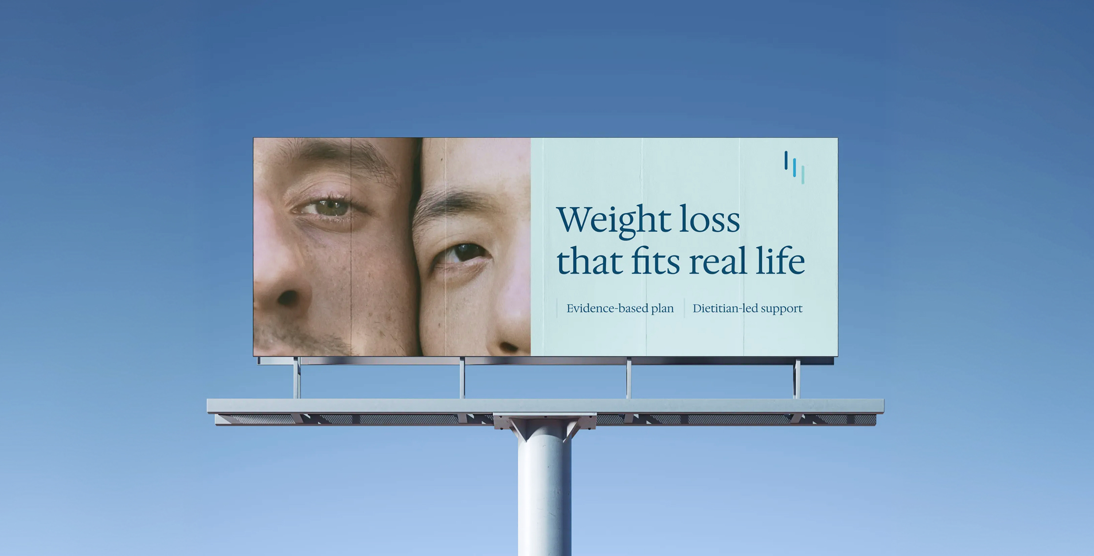
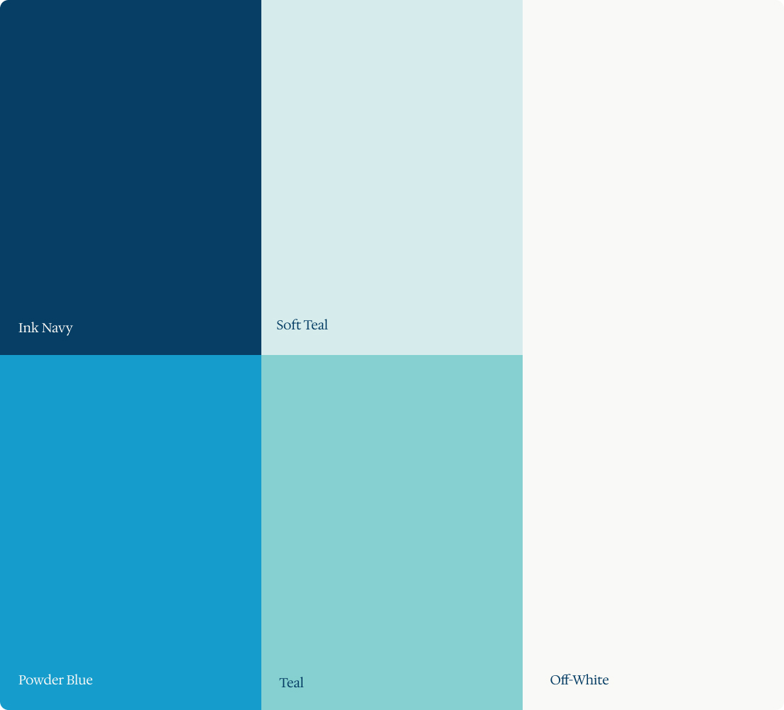
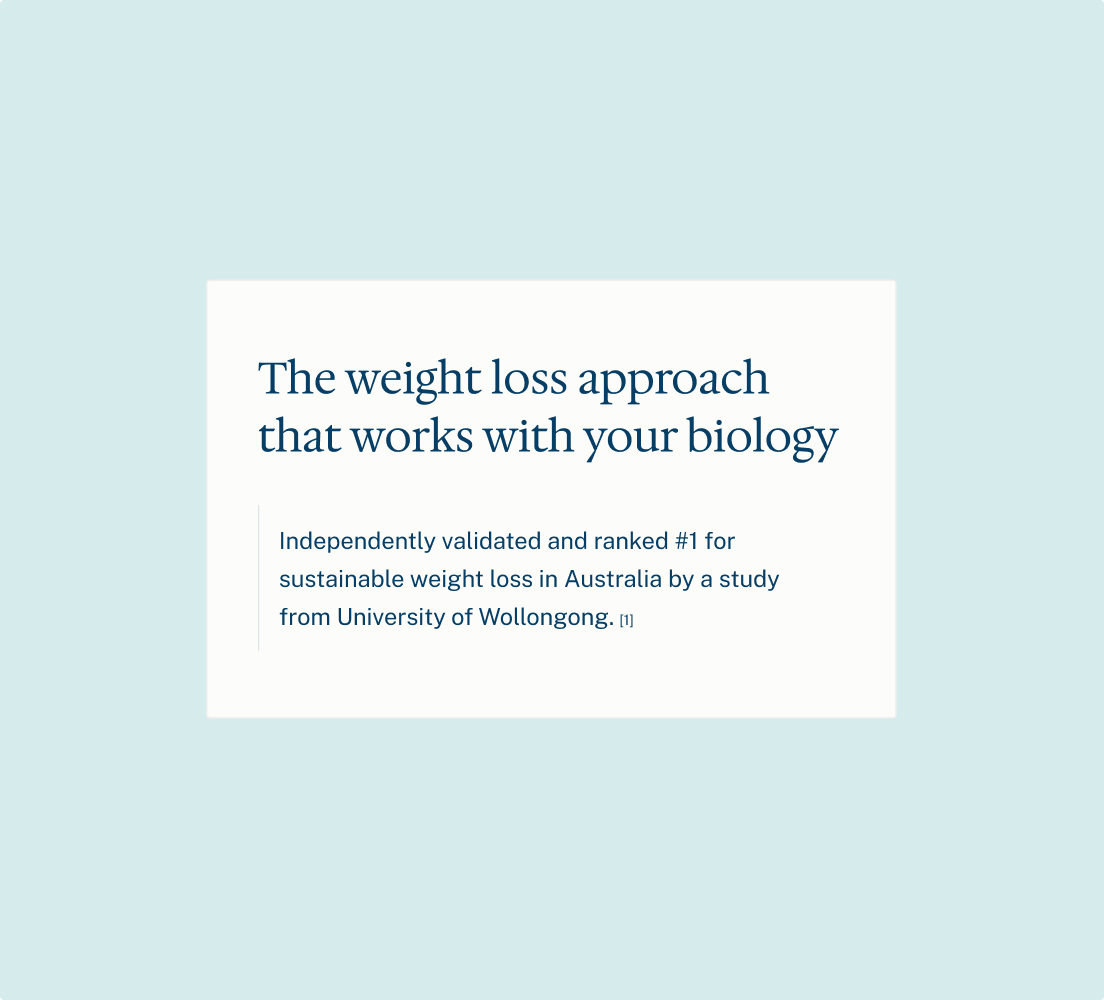
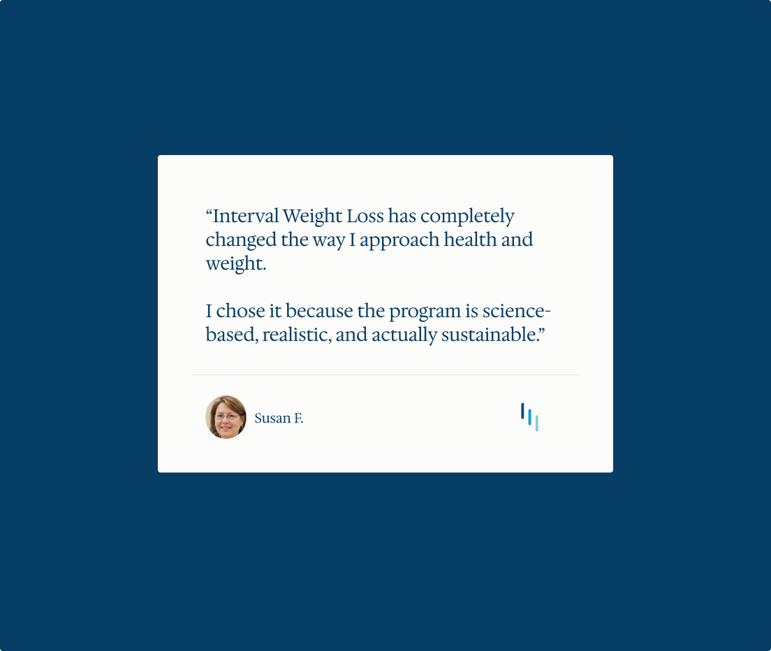
The interval icon and core blue-teal foundation was kept for familiarity. The identity focused on improving areas creating the greatest perception gap: typography authority with a new serif font, replacing stock imagery, and clearer hierarchy, spacing and colour usage to signal safe, institutional, and professional.
Digital Rollout
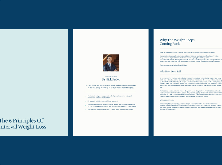
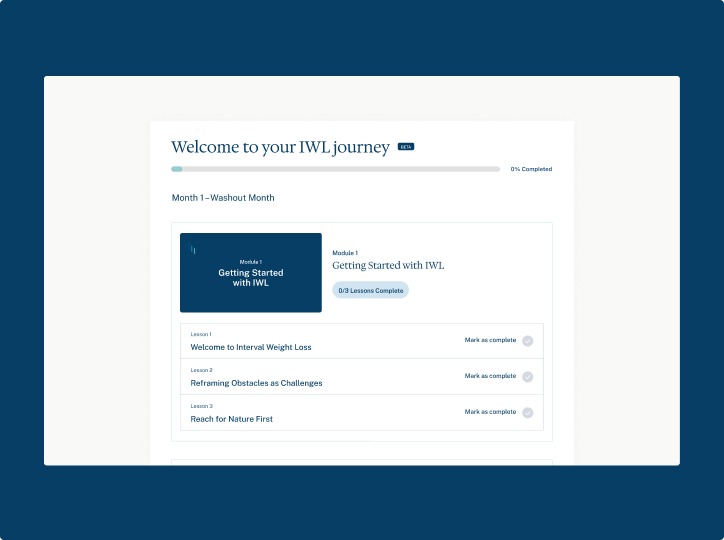
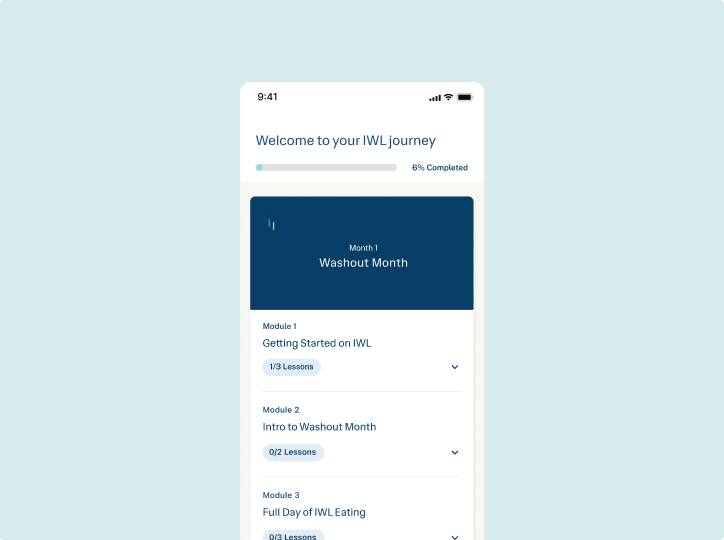
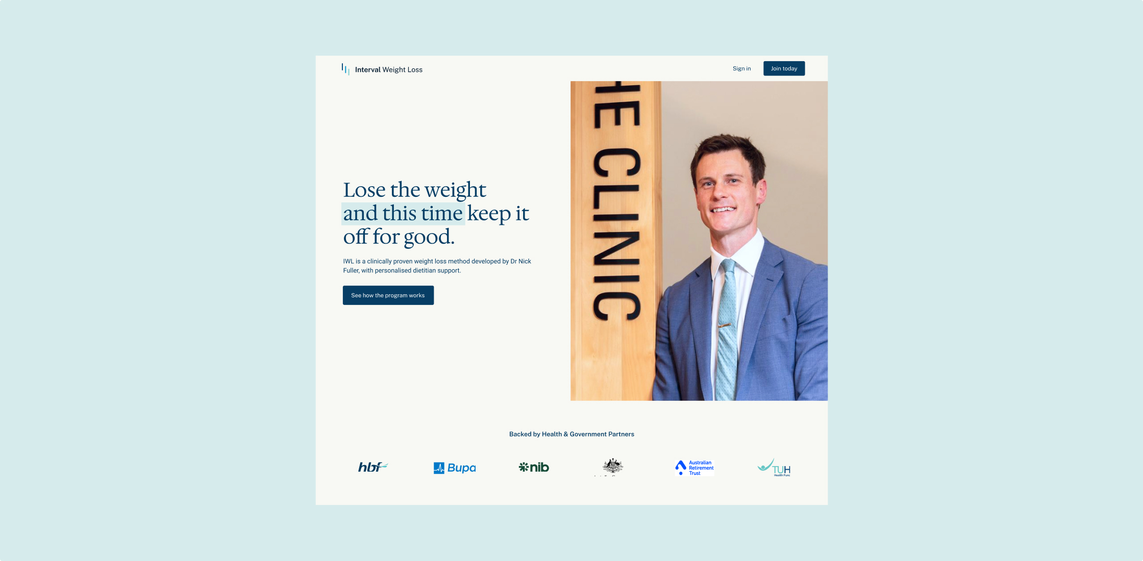
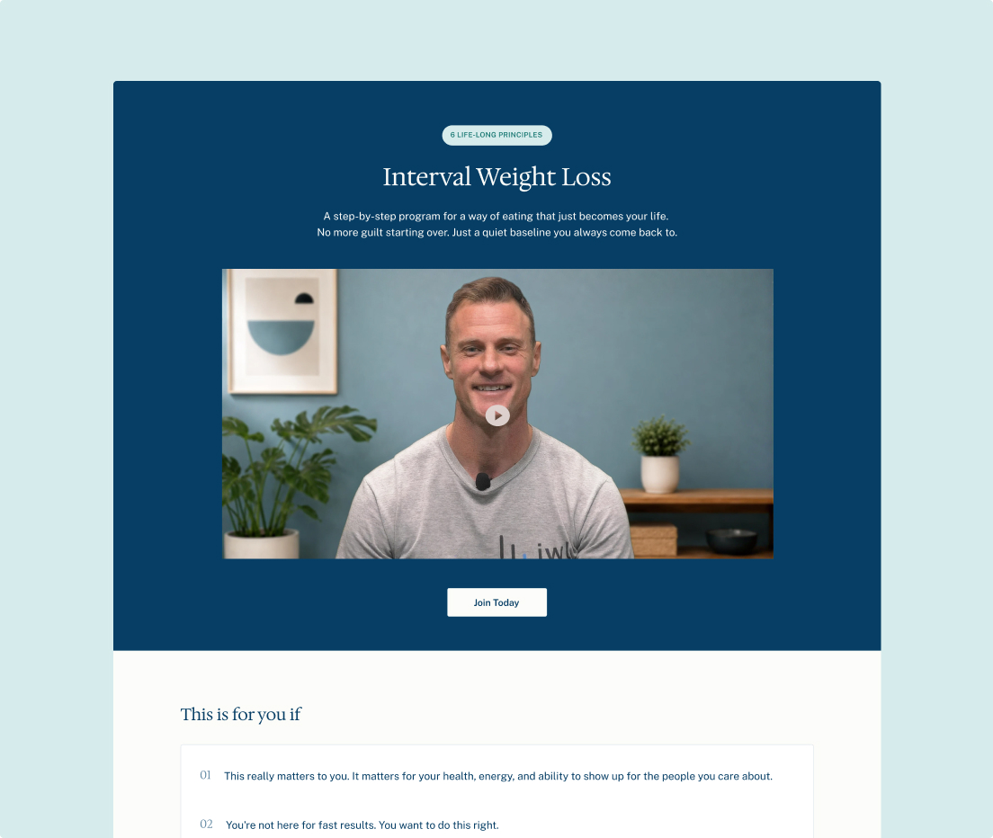
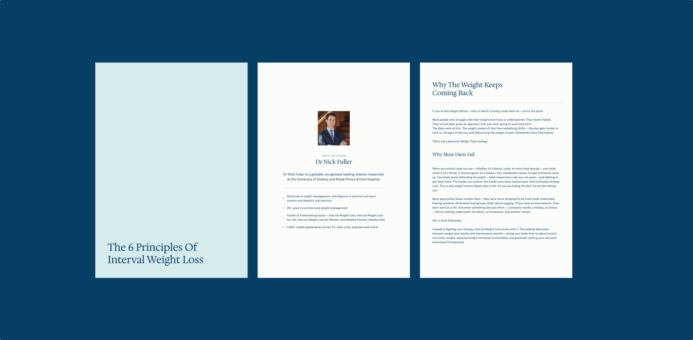
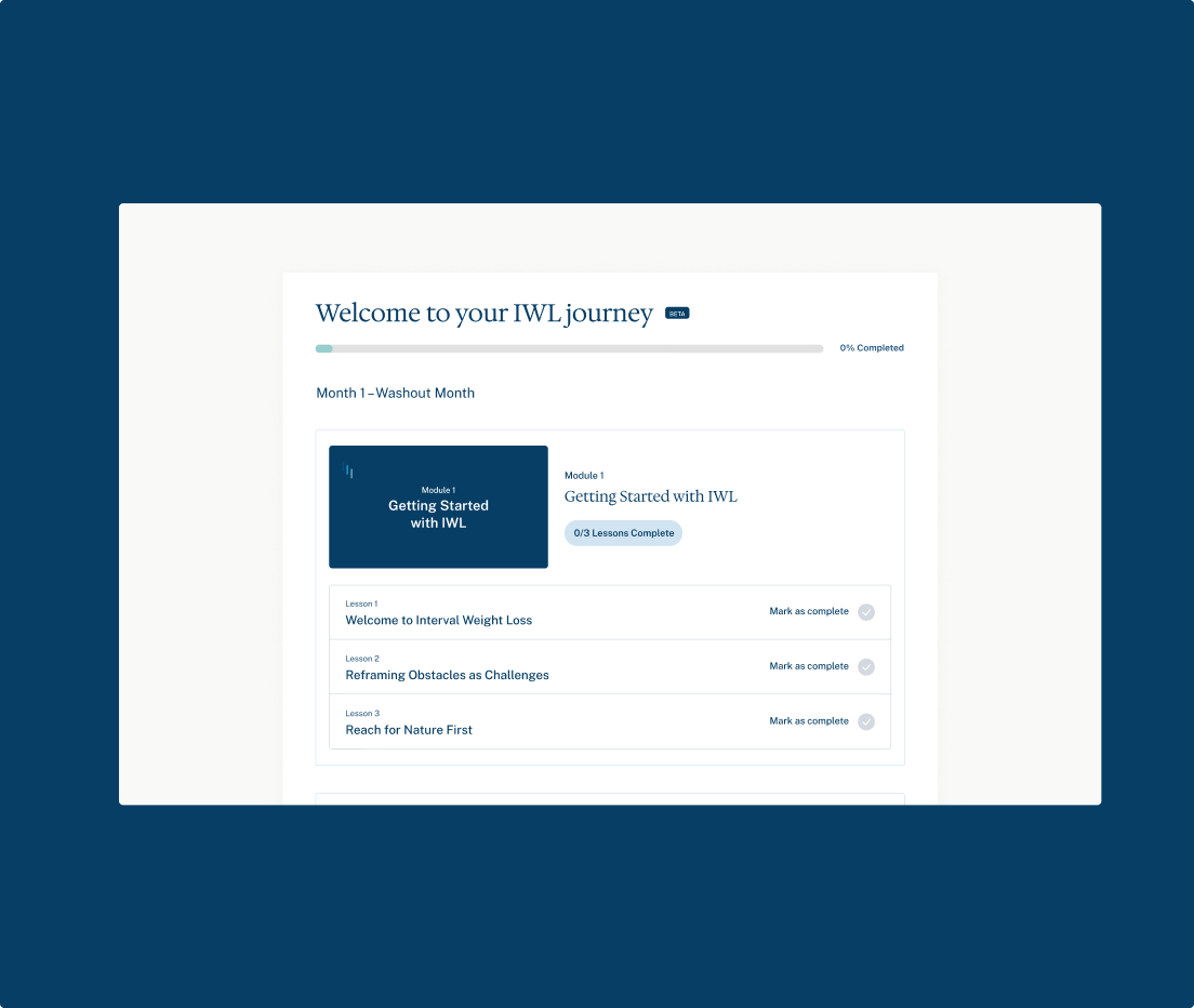
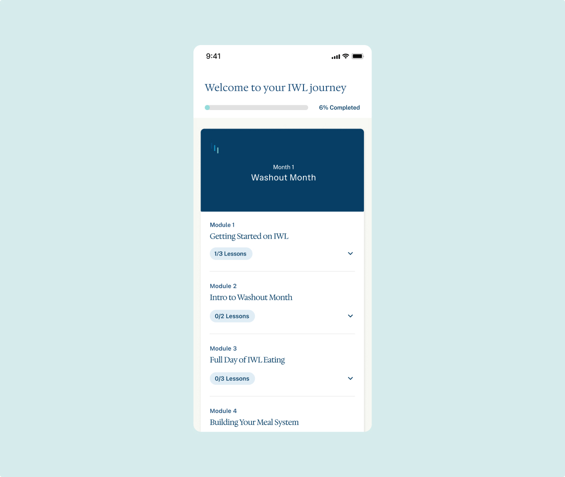
We established distinct type systems for editorial contexts (email, web campaigns) and product contexts (mobile, web app), each optimised for its own reading environment while remaining under one visual identity to ensure consistency across the full customer journey.
Type
Client work
Role
Brand strategy Visual identity Digital design Product design
Contribution
Research synthesis Identity design UX/UI design Launch assets
Collaborators
Brand strategy (positioning & messaging): Alex Lin
Year
2025
Interval Weight Loss
Project Information
IWL is a clinically tested, lifestyle-based weight loss program developed by obesity researcher Dr Nick Fuller.
Business Challenge
IWL had expanded its services into professional healthcare channels, however its consumer-led brand did not signal the clinical credibility and professional support behind the service. A brand refresh was needed to differentiate IWL from fast-results, app-led weight loss programs and position IWL as a trusted brand for professional healthcare partners and prospective patients.
Brand Solution
A core insight we found was that people did not need another promise of fast transformation. They needed a credible, supported method they could believe in after years of dieting attempts to keep weight off. We built IWL’s visual identity in mind with its core strengths and audience: credible, qualified support and a sustainable approach to weight loss – without throwing away what made the brand trusted to begin with.
Visual Identity
The interval icon and core blue-teal foundation was kept for familiarity. The identity focused on improving areas creating the greatest perception gap: typography authority with a new serif font, replacing stock imagery, and clearer hierarchy, spacing and colour usage to signal safe, institutional, and professional.
Digital Rollout
We established distinct type systems for editorial contexts (email, web campaigns) and product contexts (mobile, web app), each optimised for its own reading environment while remaining under one visual identity to ensure consistency across the full customer journey.
Type
Client work
Year
2025
Role
Brand strategy Visual identity Digital design Product design
Contribution
Research synthesis Identity design UX/UI design Launch assets
Collaborators
Brand strategy (positioning & messaging): Alex Lin